3.2.1 Dashboard Overview
After configuring your dataspace dashboard, you should see the following:
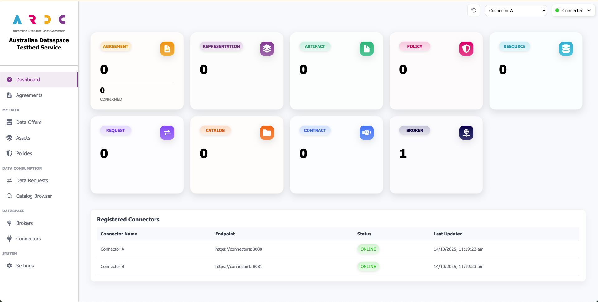
Dashboard Components
The dashboard overview is broken up into two sections:
Connector Metrics - Shows performance and activity metrics for the currently active connector
Connection Status Table - Provides an overview of all registered connectors and their current connection status
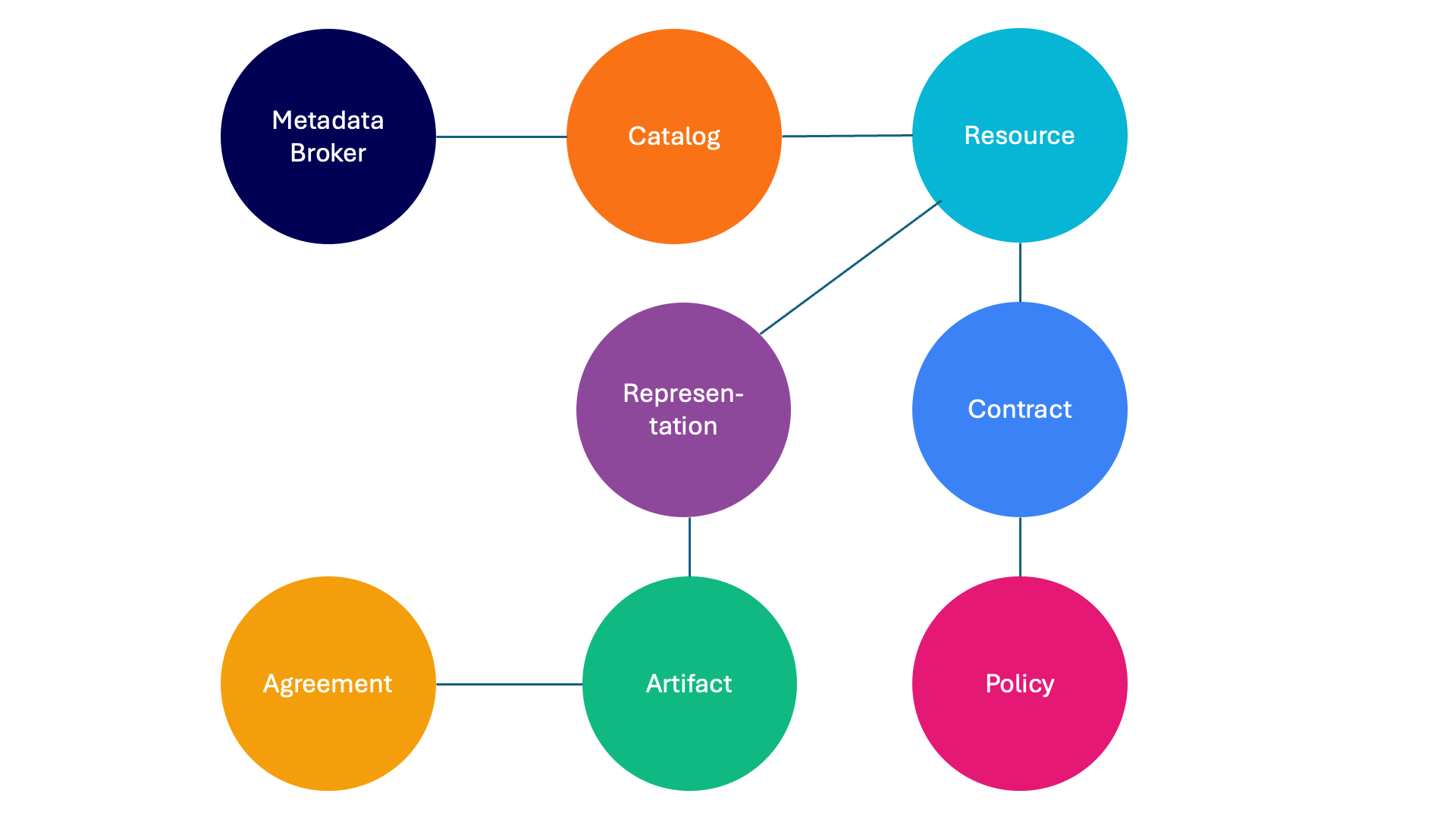
Dashboard Design and the Dataspace Model
The dashboard uses a consistent colour-coding system to help you identify and understand dataspace components throughout the interface. Each component type (such as catalogs, policies, contracts, and assets) is assigned a specific colour that remains consistent wherever you create, edit, or interact with that component. For example, catalogs always appear in orange, making them instantly recognisable across all dashboard pages.
This colour-coding system was implemented to simplify navigation of the IDSA dataspace model, which defines how components relate to each other. The diagram below illustrates the dataspace model and shows how components are connected: